
Research
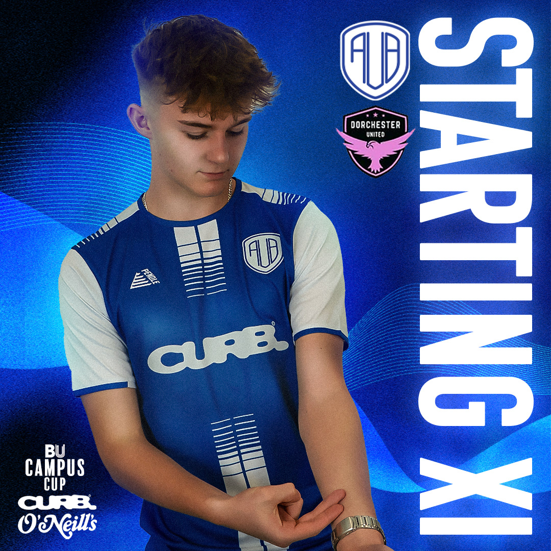
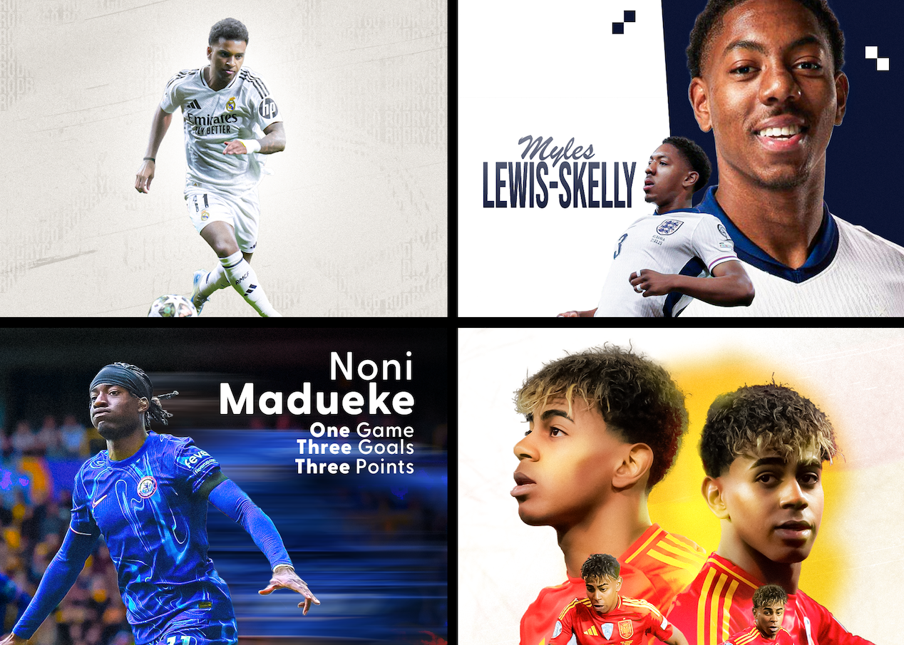
For AUB FC, I created matchday, lineup, and full-time content for Instagram, adhering to the club’s color guidelines while incorporating the crest and sponsor logos. Beyond these elements, I had creative freedom in the design process. To ensure a cohesive and professional aesthetic, I researched visual strategies used by other football clubs, focusing on typography, layout styles, and brand identity. A key takeaway was the importance of consistency across all posts, even as imagery changed. I applied this principle to my designs, creating a unified look that strengthened AUB FC’s social media presence.


For this project, I integrated various design elements to reflect both AUB FC’s identity and its Bournemouth roots. Inspired by the coastal location, I incorporated an ocean ripple effect, symbolizing the sea and beaches. To reinforce the club’s branding, I used a ribbon motif in the team’s colors, creating a strong visual connection to their kit. Additionally, I added a white track texture to evoke speed and athleticism, emphasizing the sport’s dynamic nature. These elements combined to produce a visually cohesive design that captured the team’s competitive spirit while celebrating its local heritage.
Design Process
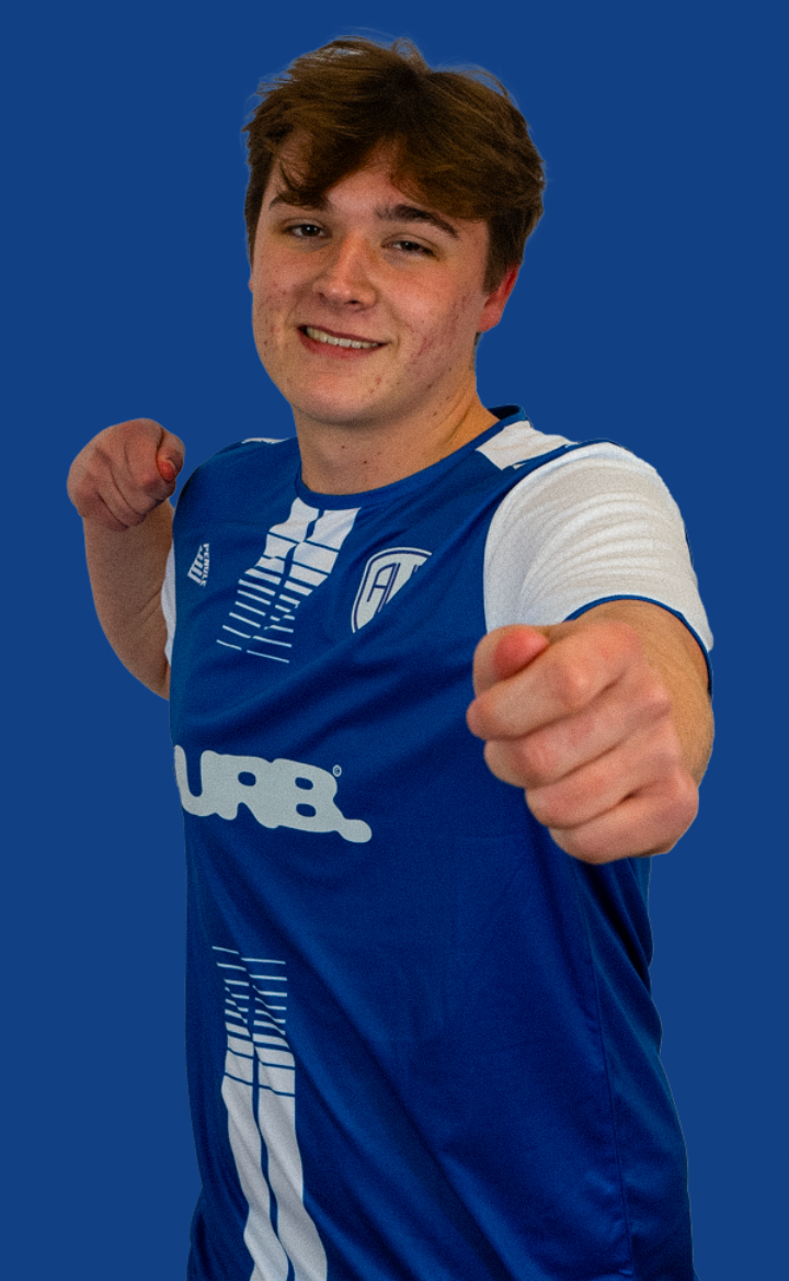


Image Development
To enhance the texture and impact of the player profile images, I applied a series of adjustments to make them stand out within the overall design. Using tools like shading and burning, I added depth and contrast, while the Photoshop Camera Raw feature helped refine details and enhance clarity. This combination allowed me to create more dynamic, visually striking images that seamlessly integrated with the rest of the composition. By carefully adjusting lighting, shadows, and highlights, I ensured that each player’s profile had a bold, polished look that complemented the overall aesthetic of the design.
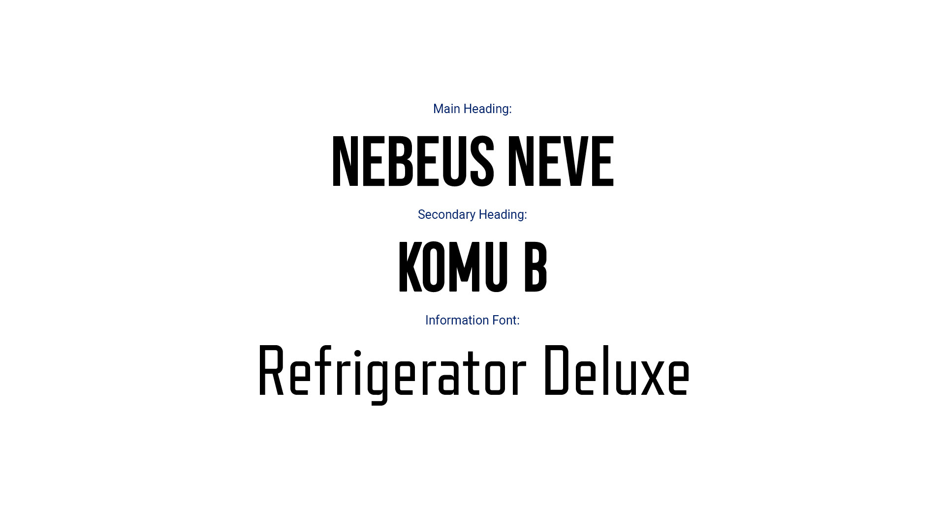
I chose bold typography for headlines based on research into football club design trends, where bold fonts are used to ensure clarity and prominence. For supporting text, I selected thinner fonts to create balance and maintain readability without detracting from key information. This combination improved the visual hierarchy and gave the design a clean, professional aesthetic, ensuring both impact and functionality across all content.
Typography
Final Outcome
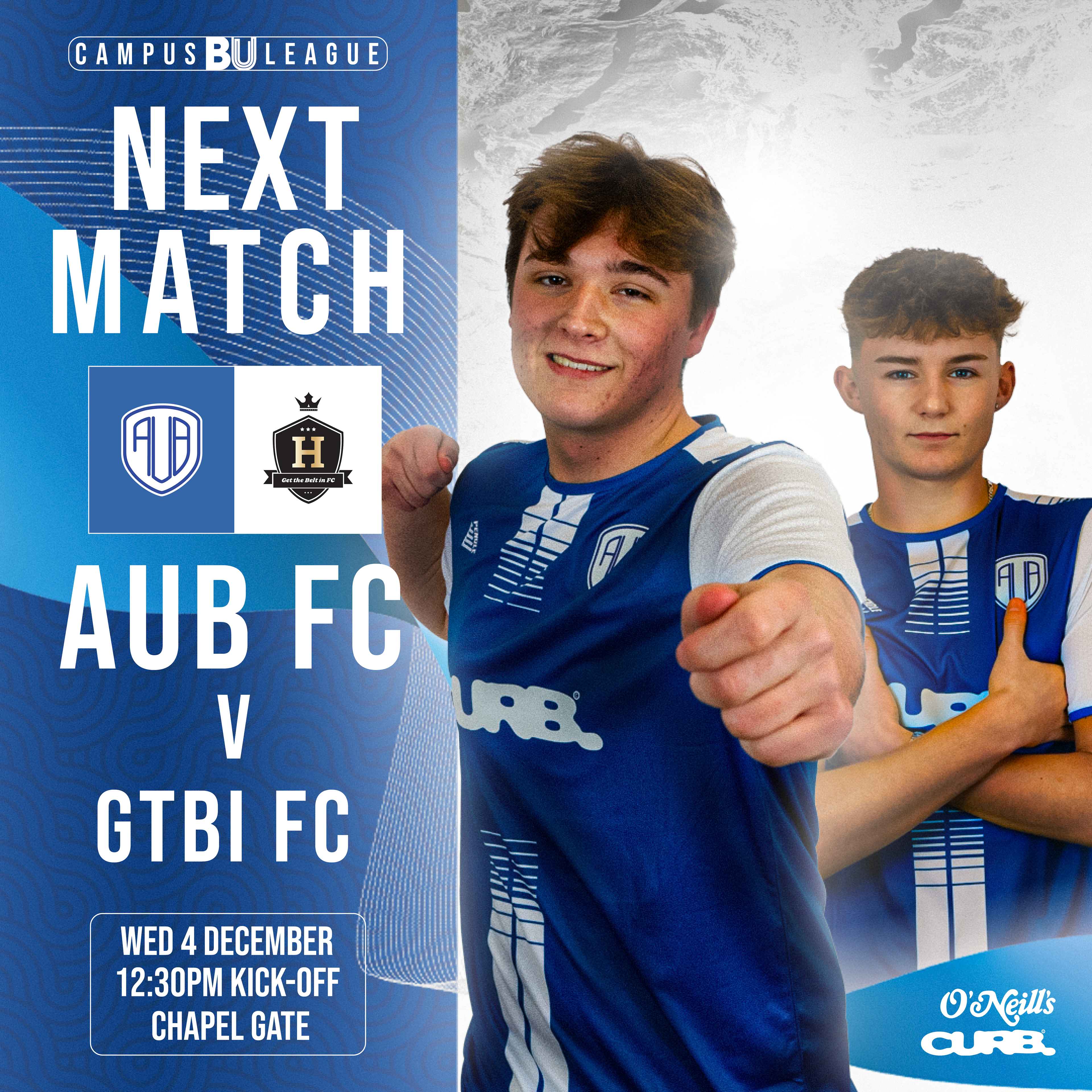
Next Match Post
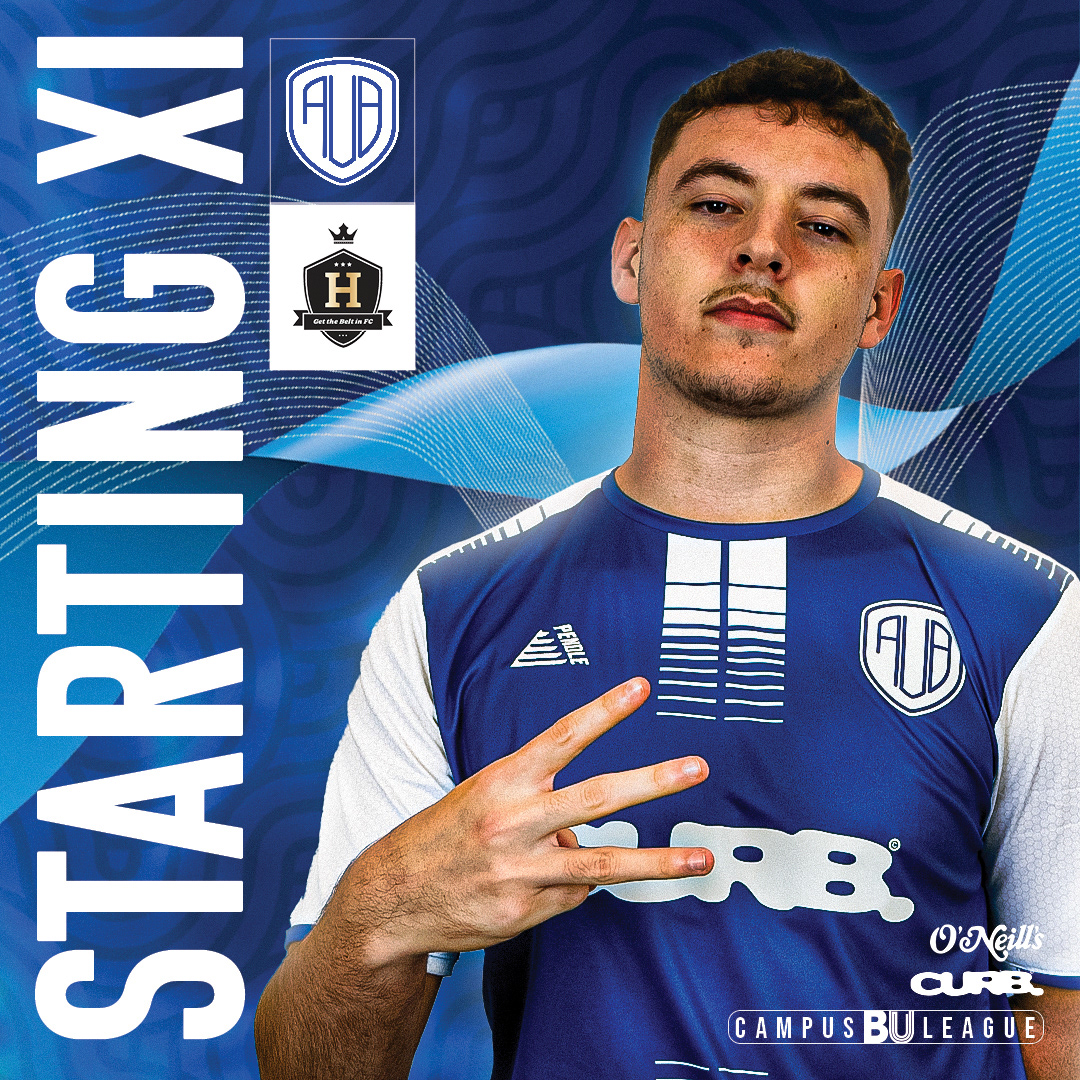
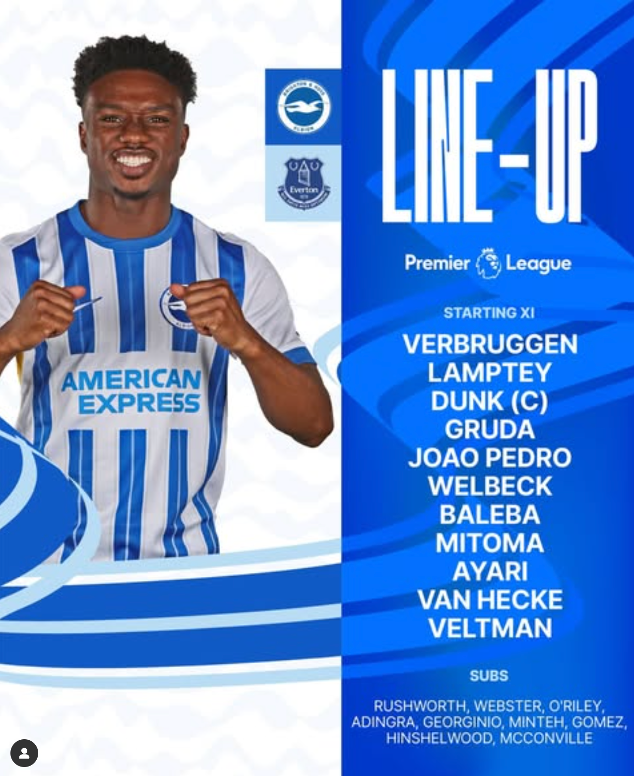
Matchday Lineup Post

Lineup Post


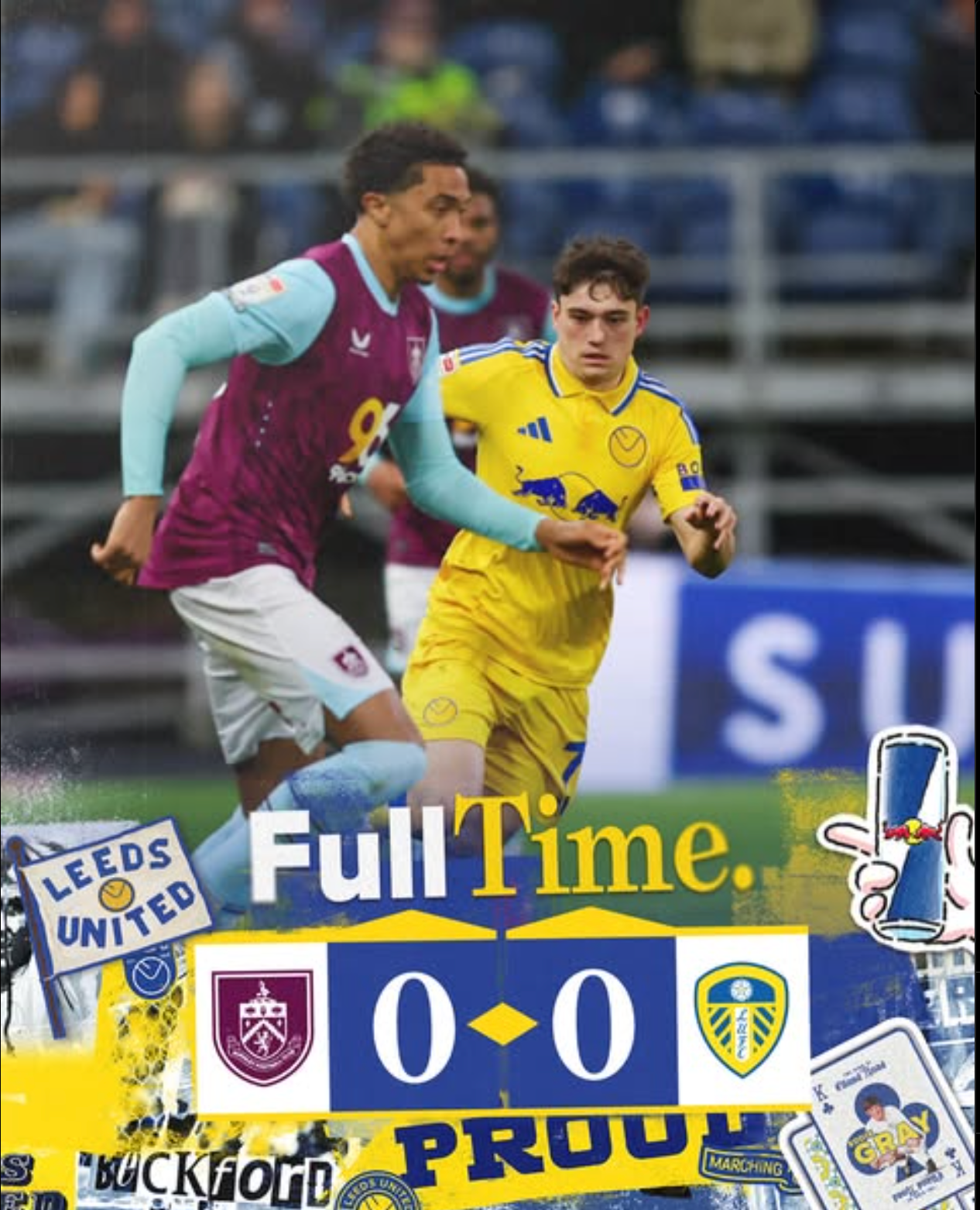
Cup-Run Outcomes